Winner of Best of Show: “Golden Number 3”, 20×30, Oil by Ni Zhu
This was my top choice because it has a number of elements that work together to make it a masterful painting. In addition to the technical and compositional considerations it has an undefinable aspect that I consider to be perhaps the most important thing in a painting. And that is the feeling or emotion that you experience when you see a great work of art.
Some of the more formal concerns that I think make this painting work have to do with the angles of the strong dark value mass created by the boats and reflections help to make it a dynamic and powerful composition. These shapes create a wedge that is countered by the oar which becomes an accent mark that leads your eye to the central figure in the composition. There is also a horizontal dominance that is countered by the vertical poles on the front of the boats. We also see beautiful atmospheric color harmonies in this work where the warms are dominant but the artist creates a cool balance that is mostly in the upper left portion of the work. This is all supported by the brushwork and surface texture of the painting. The paint is applied with confidence but without compromising the drawing or draftsmanship and looks almost effortless.
Many of the things I mention here are a matter of personal preference and there is no way to say definitively that one painting is better than another but these are my reasons for choosing this as the top painting in this show.
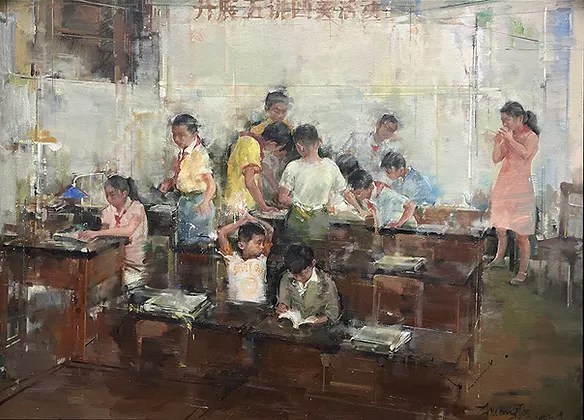
Second Place: “A Day in 1980’s Series No. 2”, Oil, 72.5×100 by Jie Zhuang
I was attracted to this painting by the overall feeling the artist conveyed through an informal composition and great handling of the paint. Our eye moves through the composition in what looks like a classroom with many children and a figure who appears to be the teacher and there is a tranquility and harmony that we experience. There is sophistication in the way the darks on the bottom are connected to form a mass that is countered by the light upper portion that forms a lighter mass and in between these major masses are smaller light and dark shapes in a kind of staccato pattern. Color is used sparingly which allows the overall dark light pattern to dominate. The artist shows proficiency in drawing the figures that are casual but accurately handled. All together these elements help to make this painting stand out and deserving of recognition.
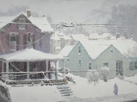
Third Place: ” View from My Studio Chambersburg”, 12×16, Oil, by Katriel Srebnik
The main thing I like in this painting is the great color harmony and atmosphere. The artist captured the subtlety of the color that was due to the air and snow between the buildings and the viewer. The house on the left demands attention because of its size and darker value but the wires tie it to the rest of the composition and the figure creates a nice balance. This painting evokes memories and feelings of days past for me since I live in an area where this type of day occurs occasionally in the winter season. Although I realize some who live in different climates may not relate to this subject in this way it made me see this as a top award winner.